WHAT MUST THE NEIGHBOURS THINK?
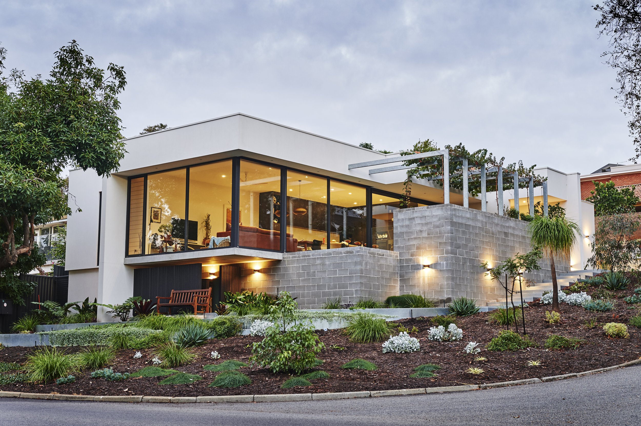
Mount Pleasant is a suburb full of homes that have been loved hard and as a result, there is a constant flurry of renovation works and new builds in the area. So, when seemingly out of nowhere and bucking the standard convention to ‘McMansion’ came Maldon Way; it became quite clear that this project was more than just another build - it was a conversation starter.
Owner’s Peter and Tegwyn are Mount Pleasant loyalists and once they decided to sell their previous (in comparison ‘sprawling’) residence just a short walk away, the idea to ‘downsize with style’ in an area they adore seemed very logical indeed.
And Mount Pleasant it seems isn’t called pleasant for nothin’ - it is POPULAR (like really, really popular), and finding an ideal location was frustratingly slow. So, when an opportunity arose to grab this corner subdivision directly across from Bluegum lake, the ‘bones’ of how this build would take shape formed almost immediately.
This is a considered home. From its footprint and build legacy to its warm and welcoming details; Maldon Way represents a very thoughtful way to building a smaller but smarter space and visually, it’s obvious why.
With its contrasting external materiality, the arbor flanking the pool and providing the perfect foliage of shade and backdrop, the concrete masonry, those massive facade windows capturing all the natural light, and the restrained easy maintenance gardens, this home has quietly redefined the downsizing norm and has tastefully brought the contemporary thoughtfulness of offsetting with it.
NEEDS VS WANTS.
Peter and Tegwyn are avidly aware that the environment and their contribution to it hold some responsibility and so during the build we paused continually to always assess ways we could minimise their contribution but at the same time stick to a budget and retain the integrity of the design.
Compromise is always part of the formula no matter what the starting point, so as an example Peter and Tegwyn opted out of a curved lounge / dining wall in favour of straight lines and a structurally easier build because ‘curves cost money’.
“Mark called us immediately after we all met as a team, with the architect, and the first thing he said was - curves cost money! He was straight up about it and didn’t hesitate to let us know how quickly building for aesthetics alone without a deeper purpose or offset was going to eat into our budget. The budget really was a huge consideration for us” - Tegwyn.
There is double glazing to 80% of the home because you cannot build on an elevated site such as this and not enjoy the view. Equally, they can be punishingly large at times too, so using that budget wisely meant incorporating pelmet details to seamlessly accommodate the internal blinds (you literally do not see them when they are up) as well as later, the addition of external soffit for the outdoor blinds. Both sets of blinds are operated electronically so they can easily control the heat and cool of the elements and how it interacts with their burnished concrete floors.
Now you might be thinking that using the ‘grid’ to operate blinds seems a little luxurious (and it is) but like we said, we used that budget wisely. Maldon Way has its own photovoltaic system - “a renewable energy technology which transforms the energy from the sun into electricity using photovoltaics”. All appliances are offset by using this system as it has a charge controller to regulate the voltage and current, and a good thing too, as there is NO gas running to site.
NOTE : whilst the market is moving closer and closer to reducing the costs of more highly efficient environmental build products, we are still not at a point where the entire build can accommodate ALL of them. As with any build, big considerations must take place to factor in the need versus the want.
CONTEMPORARY CHARACTER.
The one space in the old house that Tegwyn loved more than anything was her kitchen. It sounds super cliche that the woman of the house loves a good working triangle, but when you enjoy the art of entertaining and have your family dropping in to visit on the regular, the kitchen very quickly becomes the hub and muster point of the whole house.
In exclusion to the ebony cabinetry, the big hero of this kitchen (interior design by Jodi Balhorn) has to be the stone benchtops sourced from Zuccari Stone. Tegwyn loves spending time at south beach, which in fact, was a huge inspiration for the build in terms of tones and textures. This piece of stone in particular has the most spectacular veins of seaweed green running through it, as well smaller flecks of red earth & terracotta in perfect balance with the worldly artifacts that adorn the surfaces.
“I just love South beach. I love walking along the sand, all the colours, the strands of seaweed, and bits of wood and shells along the way. This stone is the perfect representation of that” - Tegwyn.
All the bits and pieces throughout the home are there with a purpose or memory attached. Whilst the look and feel of the home lends itself to the most contemporary of finishes, they never wanted it to feel cold, or lack a pulse. So, the selections and layout were designed to optimise the site as a priority (yet another fabulous design by Perth architect Keith Cameron Brown); but it also allows Peter and Teg to reject the ‘clinical’ look in favour of a little more warmth. We knew when we were building this home that its personality was important.
They love local too, like the bar stools made by a Margaret River artisan.
“The only thing I’ve come to realise is that there still isn’t a stool for me when people come around. When we built here, I ordered another stool to fit the island bench but we are still one short!” - Peter.
Tegwyn modeling her integrated stand-up office to perfection!
SMARTER NOT HARDER.
There are a few spaces within Maldon Way that we feel represent the perfect blueprint for downsizing, as space is something this small site did not have to throw around. Not suprisingly, multi-purposing was always high on the agenda.
Peter is a semi-retired professional wedding photographer and needed an office for editing, postproduction, and everyday small business needs. Having worked from his own designated studio in the old house meant that Peter had to really consider that need vs want again in the new house. Did he need the full swag of a studio or was it time to scale back smartly?
The new integrated office sits within the sliding cavity of the guest bedroom. Both Peter and Tegwyn work in the business and when the day is done, they simply close it off from view. Neat, tidy, compact but maximum function and use of space. There’s also the standup office integrated into the kitchen cabinetry that also allows for easy access and use of all dead spaces wisely.
The main bathroom of Maldon Way was another “what do we really need it to do"? discussion, and so incorporating the laundry into the design meant, we saved space and budget by avoiding building actual laundry and we didn’t lose any functionality in the bathroom.
OUTSIDE IN.
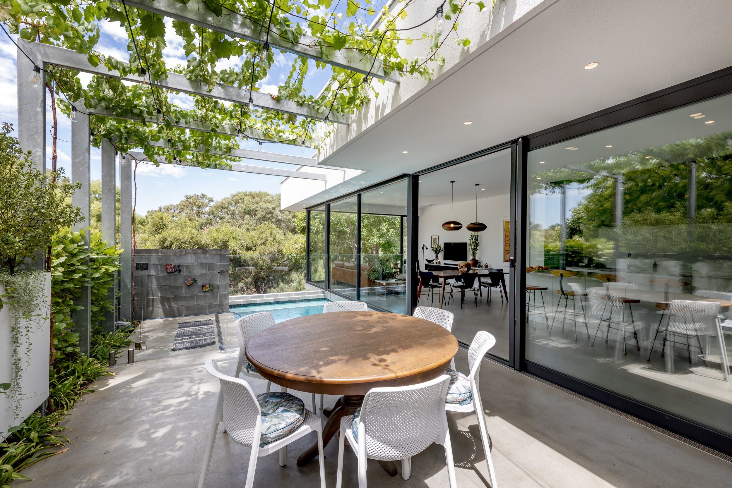
What was really interesting about this build is how the materials actually interact. If we look at the image below, I don’t think we could have expected the changes in light and shadow the elements and surrounds would play.
NOTE : If you scroll back up to an almost identical image, you can see the difference time and day make to the natural light.
You have the outlook directly across to Bluegum lake which invites nature in all year round (and quietly makes for a great spot of people watching), the poolside elements coming in through the side window and the concrete floors either absorb or ‘play' with the bouncing light as they see fit.
TAKING THE PLUNGE.
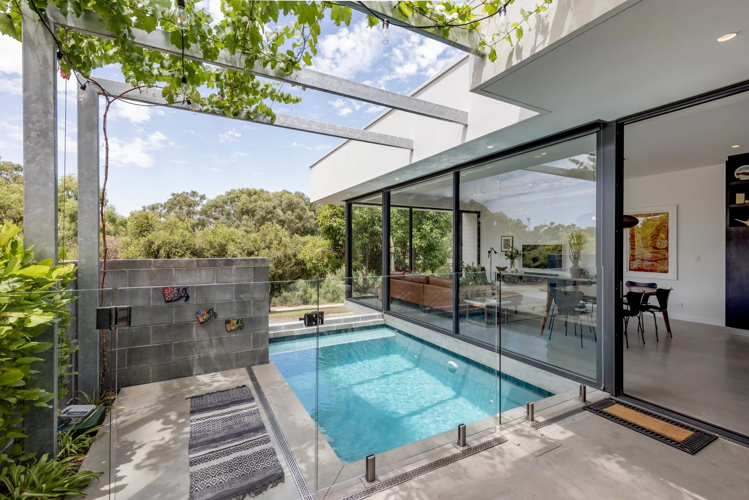
Teg was insistent that a pool made it into the design. We’re not sure Peter was 100% on board because pools require maintenance, but the pool made it in.
It might be plunge in size but not in impact with the arbor adding a huge architectural and structural talking point. The vine will fill out nicely and create even more shade as time goes on (might mean Pete has a few more leaves to fish out of the pool though - sorry Peter) but it adds another small but significant feature in using natural sources to your advantage.
Externally, the retaining concrete masonry wall gives the facade a solid dose of street cred as well as doing its job structurally and adding a textural talking element all at the same time, but getting that pool in, was an everyman job. It required all the hands available to ensure it came together without a hitch.
“Literally, the pool is being installed, and there is Owen holding this massive hose pumping in the concrete and balancing on the retaining wall making sure it all gets done properly. The one thing I will say about Mark and Owen is that they are hands-on. This house is actually their house!” - Peter.
Again, we sourced a pool pump that was as efficient as it could be to give Peter a bit of a leg up with the pool, and the surrounding drain we specified in detail to ensure it reflected the details of the rest of the home. It might sound silly to think that drains are of huge importance, but they are the unseen element of a build until they are not. They need to be just right.
PETER AND TEGWYN’S BUILD HIGHLIGHT.
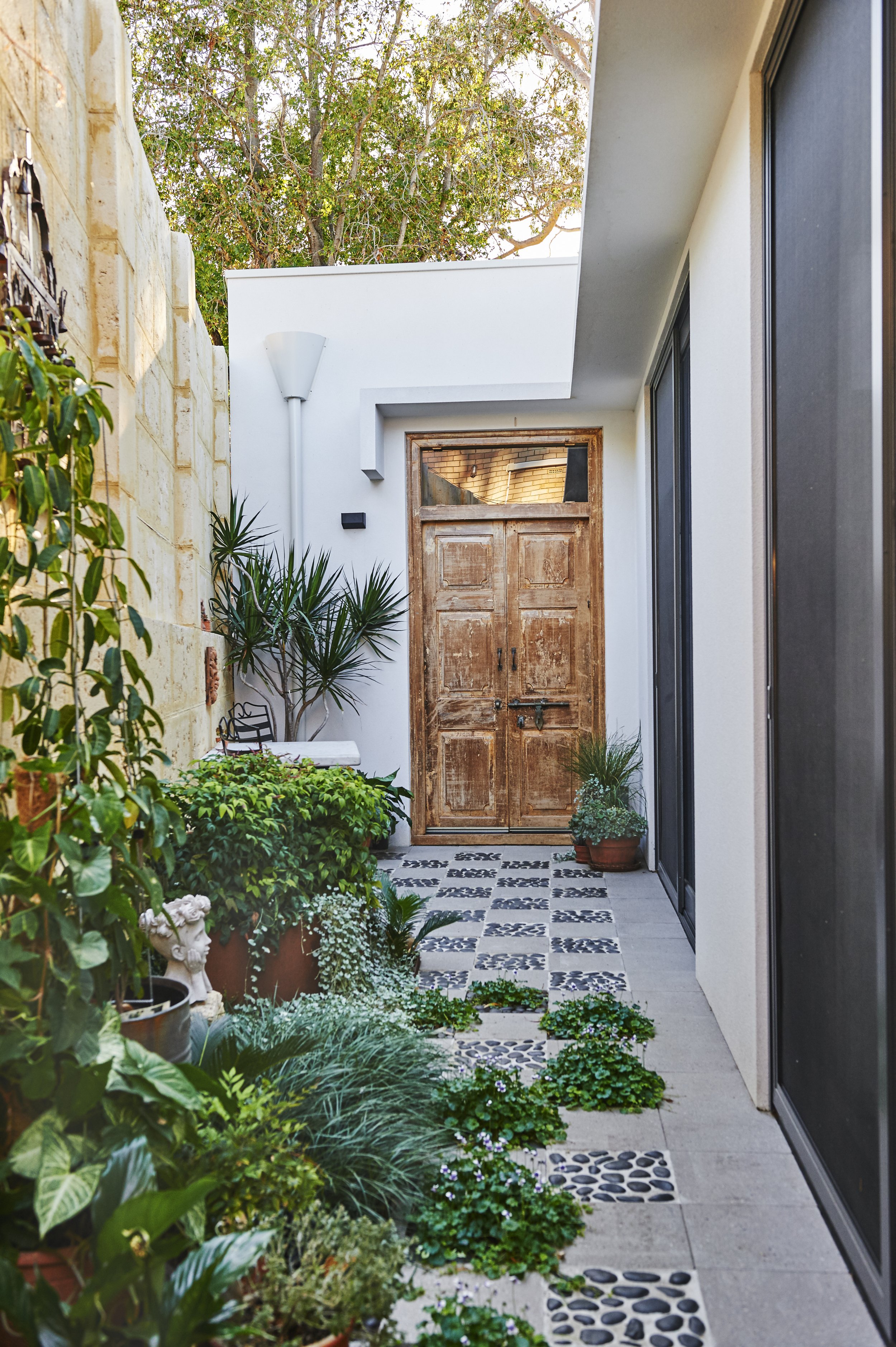
This gorgeous courtyard was the ultimate labour of love for Peter and Tegwyn.
Inspired by their travels, the idea to hit and miss stone pave the area using actual little stones seemed a great idea, and it was…just don’t ask Peter how his knees were once they’d finished.
They decided to take this part on themselves, and the result is really effective.
Located at the other end, in a direct line from the door is the outdoor shower which you can’t see that gets used each and every morning, but more on that door…
“We really wanted to find a unique piece for our courtyard that complemented our travels, so we decided to go to East West Furniture in Fremantle to source the door. We called Mark to discuss the dimensions and talk him through what we had in mind, and he said, give me 20 minutes and I’ll meet you there, and he did. There are not many builders who would invest in your build like that” - Peter.
How good does it look? It adds such depth of character to this outdoor breakout space and is a pure testament to the way Peter and Tegwyn injected their own personality into the details of the home. We were just lucky enough to build it for them.
OUR FAVOURITE PROJECT POST FROM THE GRAM.
Peter and Tegwyn have been such a pleasure to work with, because it always felt like a team effort.
Both extremely articulate and passionate about the kind of lifestyle they wanted to create with this home, it’s always an incredible feeling when you get to hand over all that hard work to clients who actually get all the hard work that went into it.
As a small, boutique outfit we truly invest everything we have into our client’s homes, and because Peter and Teg are people we hold in such high esteem, it only made us reach for the stars even harder.
Plus as Peter said, it’s actually our house too. He, he, he.
Thanks for revisiting Maldon Way with us.
We loved every bit of downsizing with such finesse and sustainability.
We’d also like to thank Peter and Tegwyn for letting us visit ‘repeatedly’ visit to shoot this home that then went on to win the 2022 MBA Bankwest Housing Awards for Best Contract Home $650,000 - $800,000.
In next month’s newsletter we’ll hopefully be showcasing yet another incredibly unique build that has recently been getting a little of its own headlines, so if you are not already on our list, hit the subscribe button and we’ll return to your inboxes shortly.
Images courtesy of Steve Nicholls and Peter Edwards Photography
Architecture by Keith Cameron Brown Designs
Kitchen design by Jodi Balhorn


